CLOSE MENU


Sign up to our mildly amusing newsletter for some inbox excitement
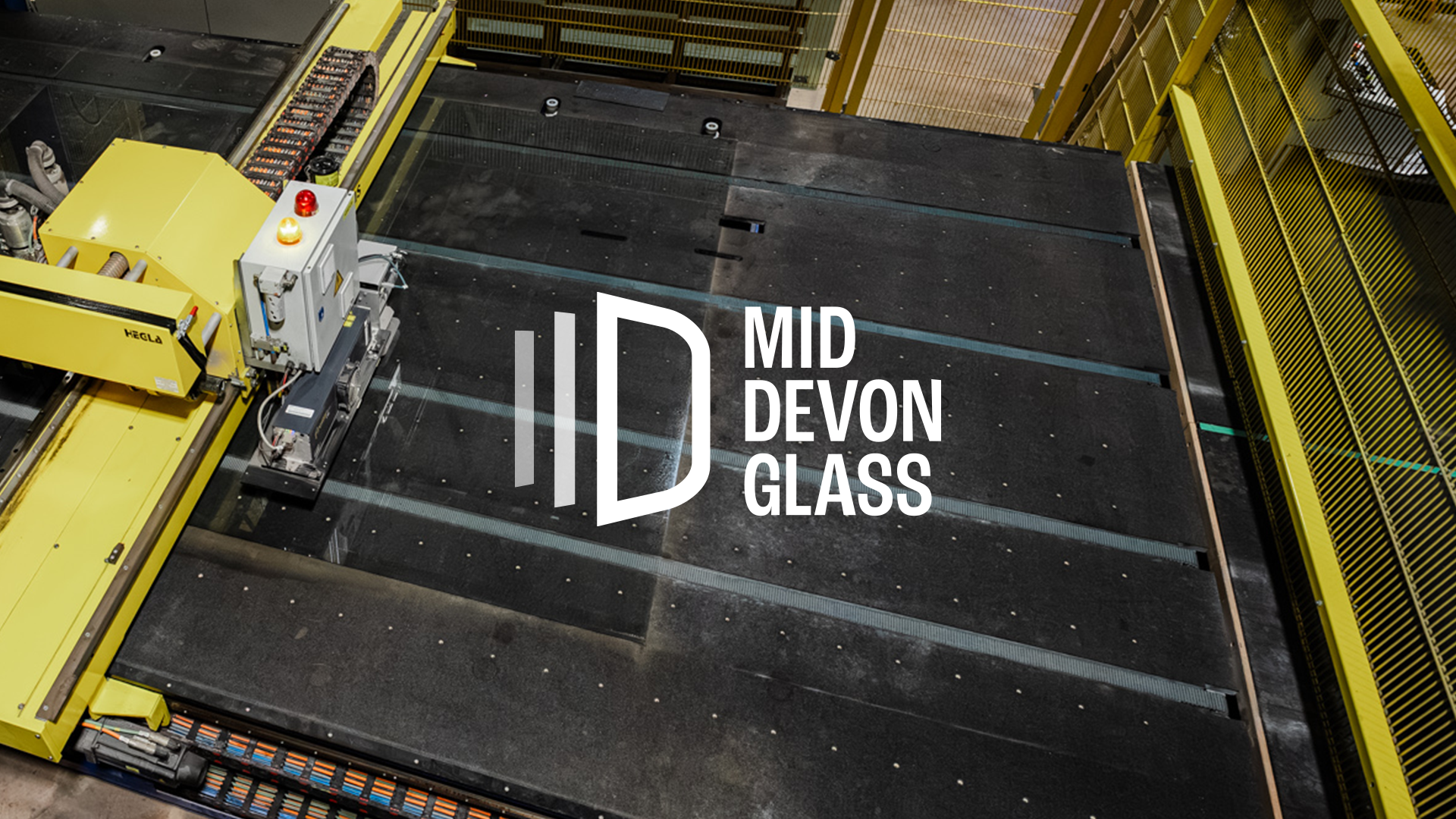
With more than 30 years of expertise and a factory built around advanced, high‑precision machinery, Mid Devon Glass had outgrown a brand that no longer matched their capability or ambition. They needed an identity that signalled scale, confidence and modern manufacturing excellence.
We began by redesigning the logo to reposition the company as the region’s leading flat‑glass processor. The new mark draws on the distinctive glass racks that define the factory environment, integrating the letters M and D into a strong, engineered symbol. Paired with a clean sans serif typeface, the identity now communicates a sharper, more industrial character that aligns with the quality and sophistication of their operation.

A secondary vertical version of the logo was also developed for situations where the landscape format is not suitable. Both versions were designed to work either out of white or reversed from the company’s primary blue.

The new suite of logos was presented to the client through a series of concept images that showed how each design could function in real‑world settings. These mockups demonstrated the logos applied across key brand touchpoints, including vehicle livery, social media profiles and post templates, and staff uniforms. By placing the designs directly into these practical scenarios, the client could more easily imagine how the refreshed identity would appear in day‑to‑day use and assess how well each option aligned with their brand presence and operational needs.

The logos were delivered with a full set of brand guidelines that clearly outlined how each asset should be applied and in which formats they should be used. These guidelines acted as a practical rulebook for maintaining visual consistency, covering everything from minimum sizes and clear space, to correct and incorrect usage across print and digital environments. Alongside this, the document specified the approved font families, detailing hierarchy, weights and use cases, as well as providing the complete colour palette with breakdowns for RGB, CMYK and hex values. Together, these elements ensured the new brand could be deployed consistently and confidently across every channel, touchpoint and piece of communication.

To support the refreshed identity, we coordinated a full photoshoot that captured a blend of video and still imagery, designed to give the brand a richer, more human visual language. The shoot focused on real environments, authentic interactions and the day‑to‑day rhythm of the business, ensuring the final assets felt grounded in how the company actually operates. This approach produced a versatile library of content that can be used across marketing, recruitment and internal communications, showcasing not only the company’s technical capabilities but also the personalities, expertise and teamwork behind the operation. The result is a bank of imagery and footage that strengthens the brand story, adds credibility and provides long‑term value across every channel.


A key part of the Mid Devon Glass brand refresh was the creation of a new website to replace the previous single‑page version. The goal was to build a digital presence that, like the refreshed brand, accurately reflects the scale, capability and professionalism of this first‑class glass processor.

Custom photography and video were used to anchor the brand in real craft and real production. These assets introduce movement, materiality and a sense of precision that carries through the entire site.
The website is designed as a clean, confident digital environment that communicates reliability and technical expertise.
The homepage opens with a full‑width video header that immediately conveys scale and craft. This sets the tone for a site that balances industrial capability with the personality of a family‑run business.

Clear typographic hierarchy guides users through product categories, sectors and testimonials, while consistent spacing and modular blocks create a predictable rhythm across the site.
Navigation is deliberately simple, with product families grouped into intuitive clusters that support both trade and residential users to access information quickly.
This project demonstrates how SPS Marketing can translate a technical, trade‑focused offering into a clear, modern and user‑friendly digital identity that strengthens brand credibility and supports commercial performance.


Bringing AWP’s vision and work to life in their offices with feature walls and graphics.

Creating a website to capture the energy and expertise behind Solutions on Stage.
